

A More User-Friendly Library
Libraries should be applauded for continuing to connect their communities with resources during these challenging times. We all hope that it won’t be too long before libraries can safely re-open and we’re not reliant on digital services alone. We believe that the demands placed on libraries will increase in specific areas, for example, with people seeking advice on how to find a job and support for parents and children as school attendance will probably be alternating days. The management of social distancing and the higher sanitation demands for the building and for borrowed items will need to be instituted to keep the staff and public safe. In a small way, having a user-friendly library may help patrons to be a bit more self-sufficient to aid with social distancing.
Whenever we design a library, a high priority is to organize the building for the users to easily find their way through it and to be aware of the services that the library has to offer. Certainly, some of this can be achieved with signage but most is achieved through organization. Library staff can easily become 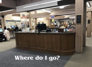 comfortable with their buildings; they know where everything is and can assume the patrons are as knowledgeable. Whenever I visit a library, I take advantage of entering the building as a new patron to see if I can find my way easily. This is a great test that every library should perform at least annually to understand if the building is user friendly.
Start by driving to the library: Is the building easy to find? Is the driveway  entrance clearly marked? Once parked can you find the building entrance? When you enter the building do you know where you are? Continue through the building asking similar questions. You would be surprised at how many times these basic cues to get into the library are not present. One more thing on this: Library directional plans are often placed near an entrance point. Multiple plans may be required throughout the building. I often find that the same plan is used for all locations. Unless each plan is correctly oriented for the location, they will be confusing and not help the patrons.
We have found that most libraries fall into a few organization structures with the goal of simplifying the patrons’ experience. Please see how your current library is generally organized.
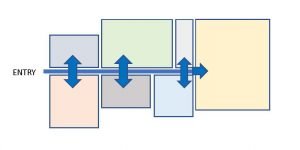
1. ALLÉE (a walkway lined with trees).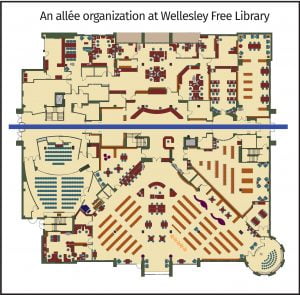
In this representation the walkway is the path through the library and the trees are the areas of service.
The walkway can be a straight line, a curve, or another shape made with a line where the ends don’t touch. Some examples include:

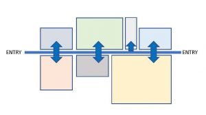
From these “walkways” we add the spaces, represented by rectangles, and each space is accessible from the walkway. This organization works well if there are two entrance points to the library.
2. CUL-DE-SAC.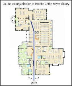
This is similar to the Allée but with one closed end. This is most often seen in smaller libraries and changes how the spaces are organized. Utilizing the same spaces as above, the layout would be re-organized as shown.
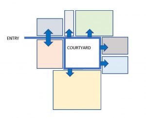
3. THE CIRCLE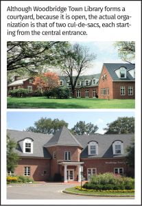
The circle is any closed loop. It is often found with one or two interior courtyards and allows more light into the building. This tends to be a more expensive approach as there is more exterior wall. Some libraries have taken this concept and added a skylight or clerestory windows over the center to make more program space.
4. THE CLUSTER
In the last of the general organizations, spaces merge from one 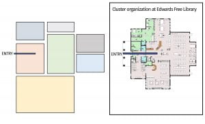 to another with no definite aisle. This can be a difficult organization but fortunately this is found in small libraries, often with multiple floors where the organizing structure is vertical in the form of a staircase.
Once you have identified the organization that mostly matched your library, there are a few things that can be done to help the patrons find there way through the building and find what they need:
- Move furniture out of the aisle space so the pathway can be clear and provide direction. Low furniture can be included in the aisle where space is at a premium but remember that the aisle should appear different from the rest of the space.
- Where necessary, add signage along the sides of the aisle(s) to identify material locations.
- Service desks should project slightly into the aisle where they can be easily seen but not so far as to block the walking space.
- Public access catalogues and self-checkouts should be next to the aisle(s).
- If you have a Cluster organization, try and create an aisle to organize the space and then follow steps 1 to 4.
- If you have a multi-level library select an organization for each floor.
- If you are re-finishing the spaces, select different colors and materials for the aisle for it to be distinct from the other areas. It can still be based on the color scheme selected for the library. In the photo a blue line is used to lead children to the storytelling room that does not connect to the aisle.
- Consider how to effectively use the aisle space. This is the best area to actively display what the
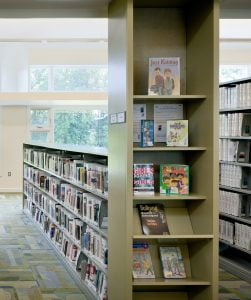 library has to offer and for those high turnover items. New materials and AV materials are common along aisles as well as counters/shelves/pamphlet holders that can be used for such items as tax forms and general notices. If the ends of the ranges of shelving face the aisle, consider adding end panel shelves or slat-wall for face front display. It is also a good place for noticeboards or monitors to publicize up-coming library activities.
When deciding how best to use the aisle consider how much space is available and select from your priorities only those that will avoid a cluttered feel. Some of the recommendations will be easier to achieve than others, but whatever you are able to do will make your library more user friendly.